
RKID
Spinningfield's Brand Activation
RKID
Brand Activations & Pop-Ups: RKID's Yellow Takeover of Spinningfields
Event
RKID | Spinningfields, Manchester
Scale
2-Week Residency
The Scope
End-to-End Delivery (Build, Procurement, Staffing, Operations)
The Squad
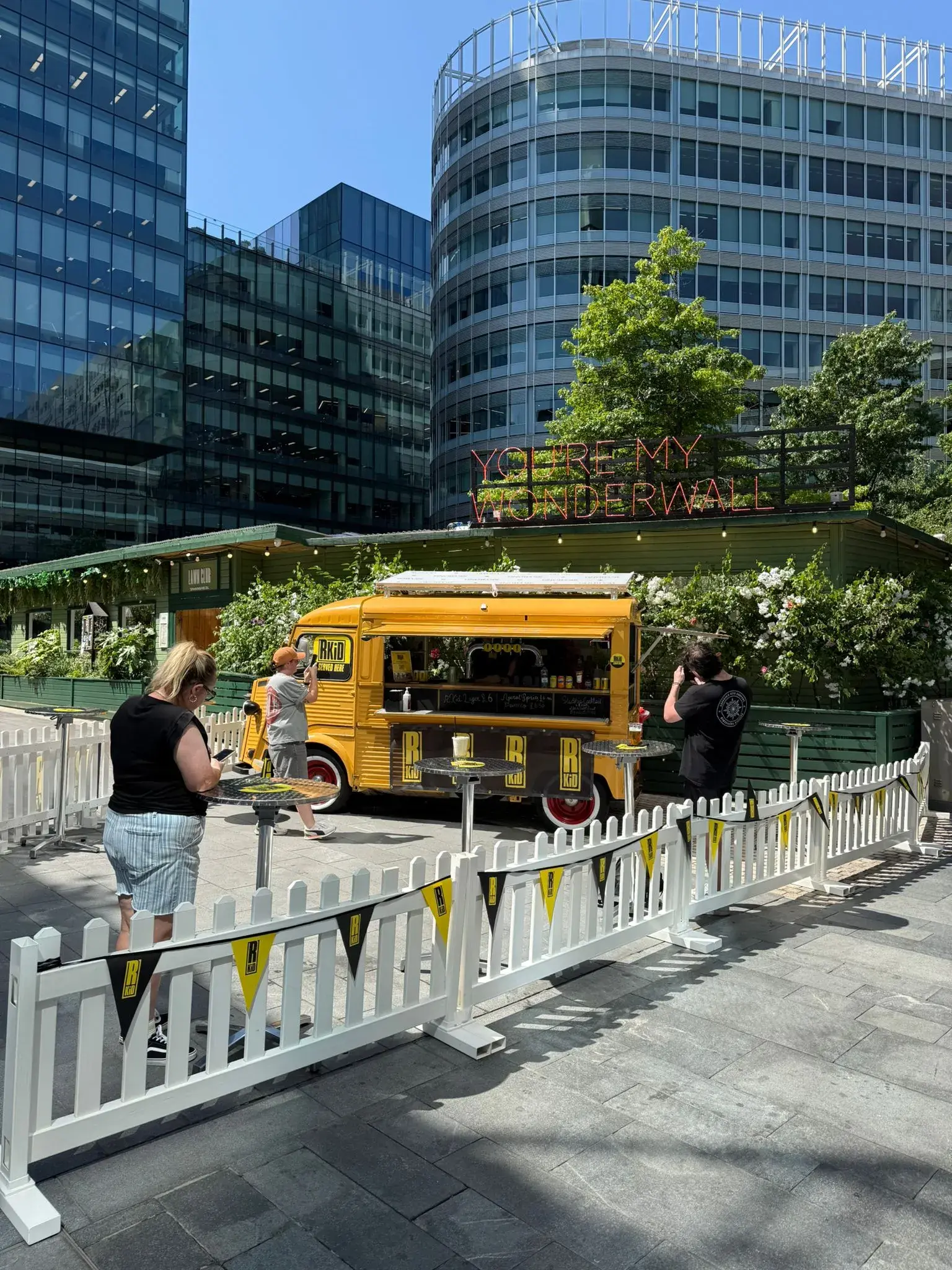
Bespoke colour-matched bar installation
The Mission
Creating a brand home, not just a temporary stand
More Than Just a Pop-Up.
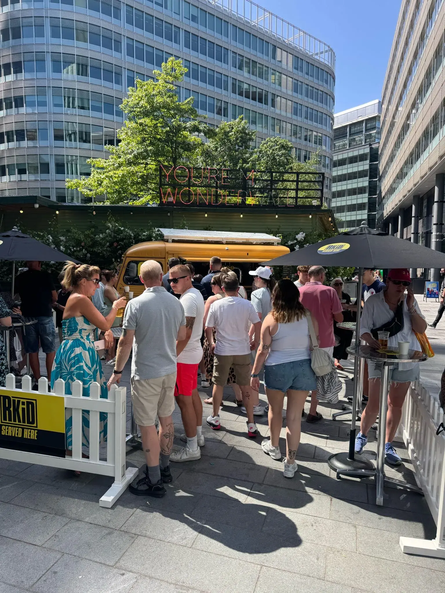
In a city as busy as Manchester, standing out is hard. RKID didn't just want a temporary stall; they required a physical brand presence that felt intentional, permanent, and embedded in the culture.
When it comes to brand activations & pop-ups, the danger is often that they feel flimsy or disconnected. RKID needed the opposite. They needed a social hub that looked as good as the brand feels, right in the middle of Spinningfields—one of the city's busiest commercial districts.
Visual Identity Meets Operational Reality.
The brief was specific: bring the brand to life physically. This wasn't just about staffing a bar; it was about building one.
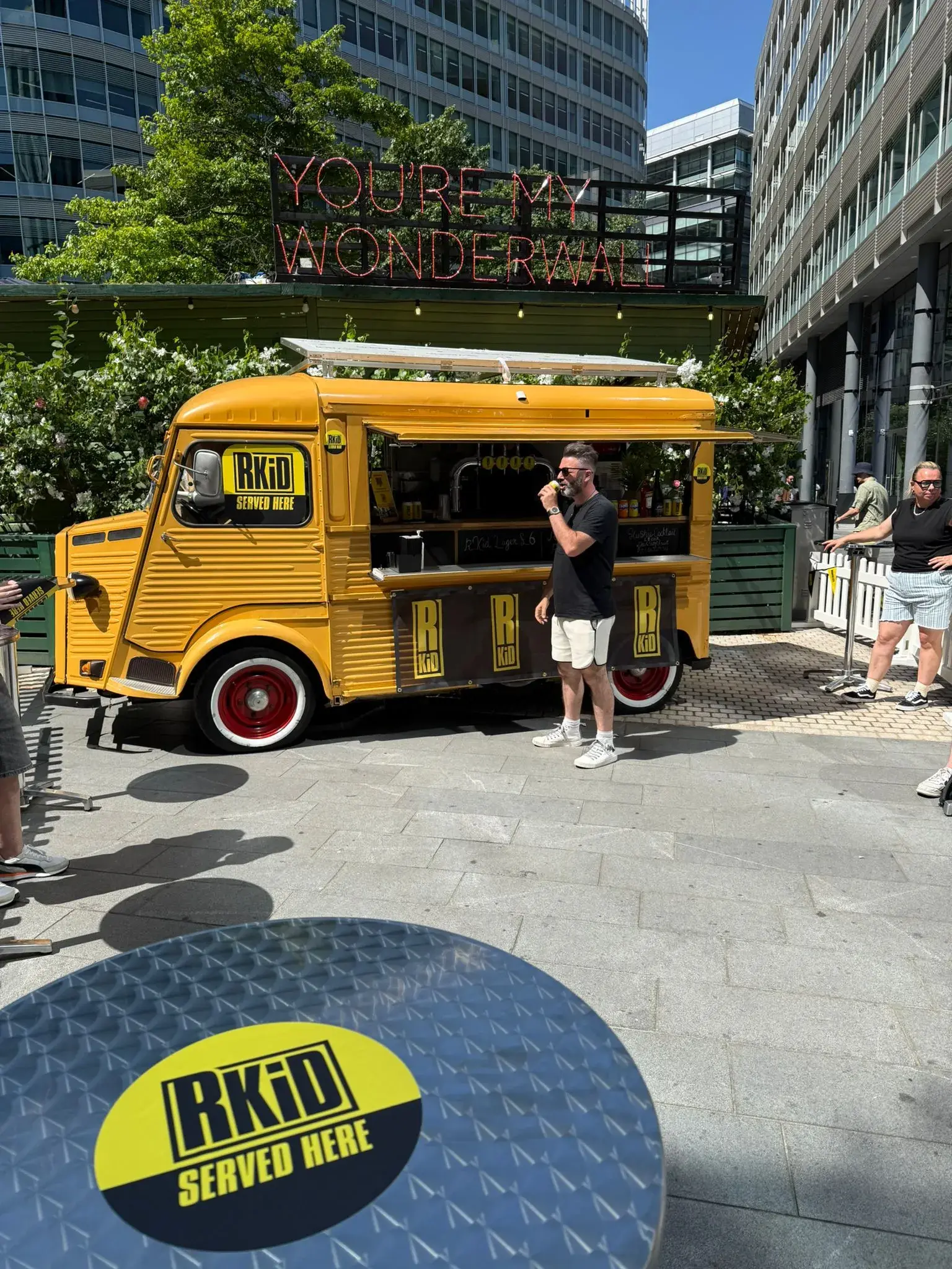
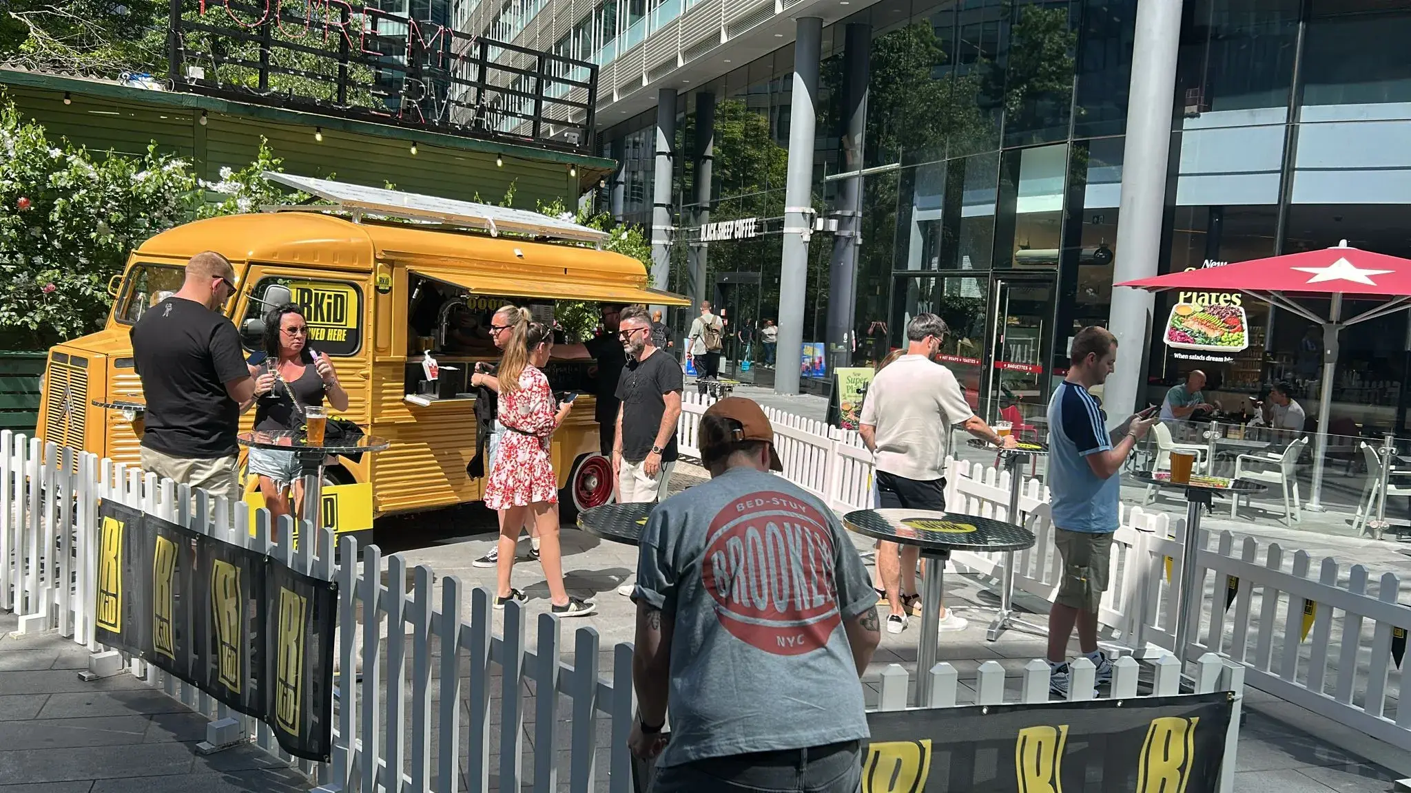
The challenge was to deliver a fully functional venue from scratch in a high-footfall public space. The aesthetic had to be perfect—specifically, a bespoke yellow bar unit colour-matched exactly to RKID's identity. It had to look sharp, function perfectly, and handle the consistent flow of the Spinningfields crowd.
Controlling Every Layer.
We took the "End-to-End" brief literally. We moved beyond our role as a staffing agency and acted as a full production partner.
The Build: We sourced and procured the bespoke yellow bar unit, ensuring the visual impact stopped people in their tracks.
The Setup: We handled the logistics of installation and bar setup, turning an empty space into a fully operational venue.
The Service: Once built, we handed the keys to our best teams. We managed the full bar operations and staffing throughout the residency, ensuring the service standards matched the visual quality.
A Cohesive Experience.
The result was a clean, brand-led activation that functioned as both a marketing tool and a genuine social hangout. By controlling every layer of delivery—from the colour of the paint to the speed of the service—we ensured the experience felt cohesive.
This is the standard we set for brand activations & pop-ups. It wasn't just a logo on a wall; it was a fully realised environment. We built it, we ran it, and the city loved it.
Let's work together